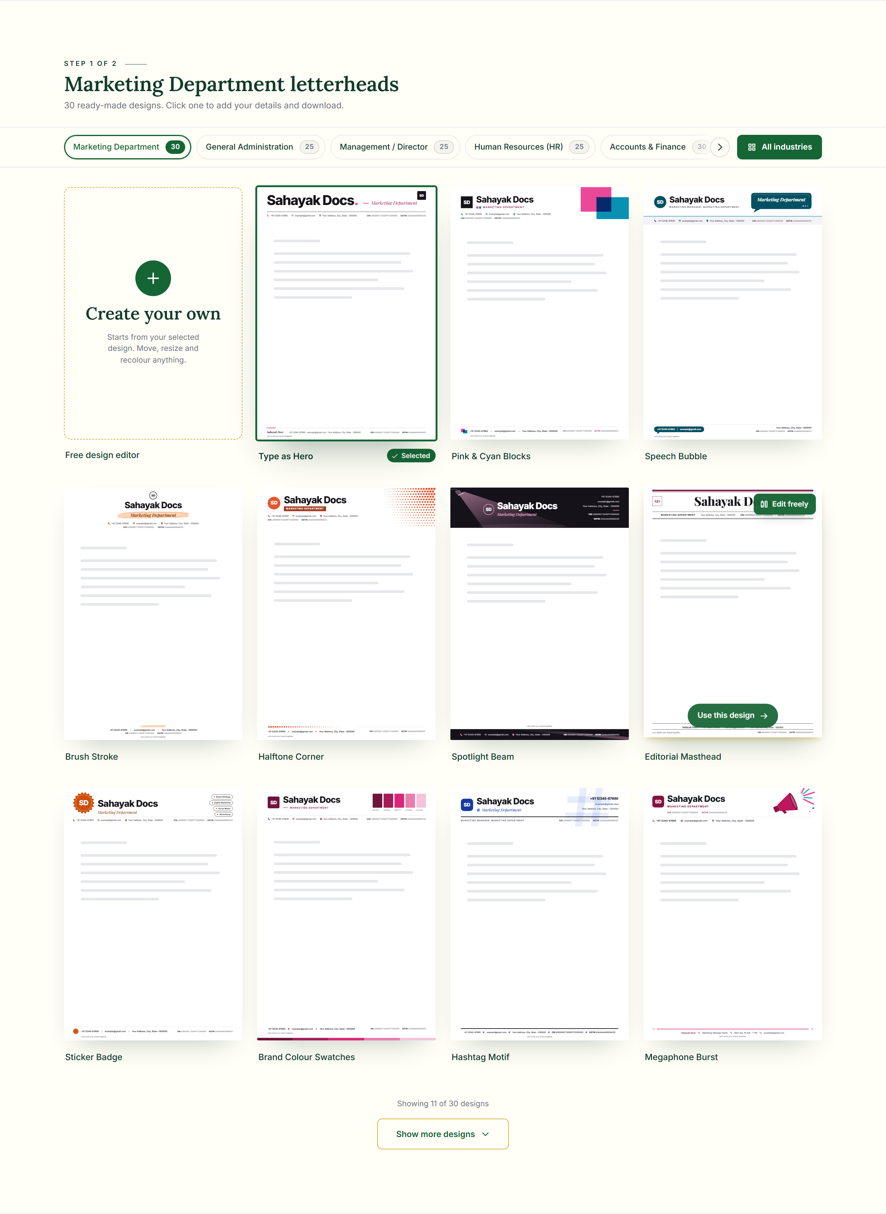
A good letterhead example shows more than a blank template — it shows how a logo, name, tagline and contact details actually sit together once they’re filled in. Every design here is already an example: open any of them and your own business name and logo appear in the same layout immediately, so you can judge it with real details instead of imagining them.
What makes a strong letterhead example
- The logo is sized to be noticed first, but never so large that it crowds the name or address.
- Contact details and registration numbers sit in a clear, consistent spot — usually the footer — so they don’t compete with the business name.
- Enough plain space is left in the middle of the page for the actual letter; a letterhead that fills the page looks busy, not premium.
- Colour is used once, deliberately — on the logo, a rule line or an icon — rather than scattered across the page.
Examples by industry
Every industry on Sahayak Docs — clinics and hospitals, companies and their departments, shops and retail, professional services, factories, schools and NGOs — has its own set of examples, built around what that business actually needs to show. A doctor’s example leaves room for a registration number and qualification; a shop’s example is built for a cash memo; a company’s is built for formal letters and quotations.
The same example, two accent colours
This is the same “Shield & QR” design, with nothing changed except the accent colour — the layout, logo placement and every field stay exactly where they were.
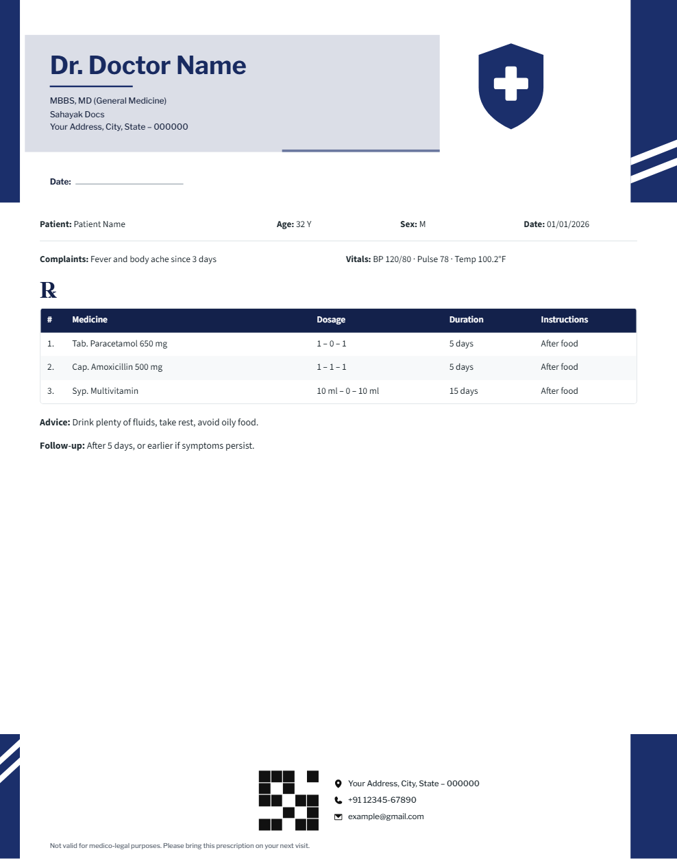
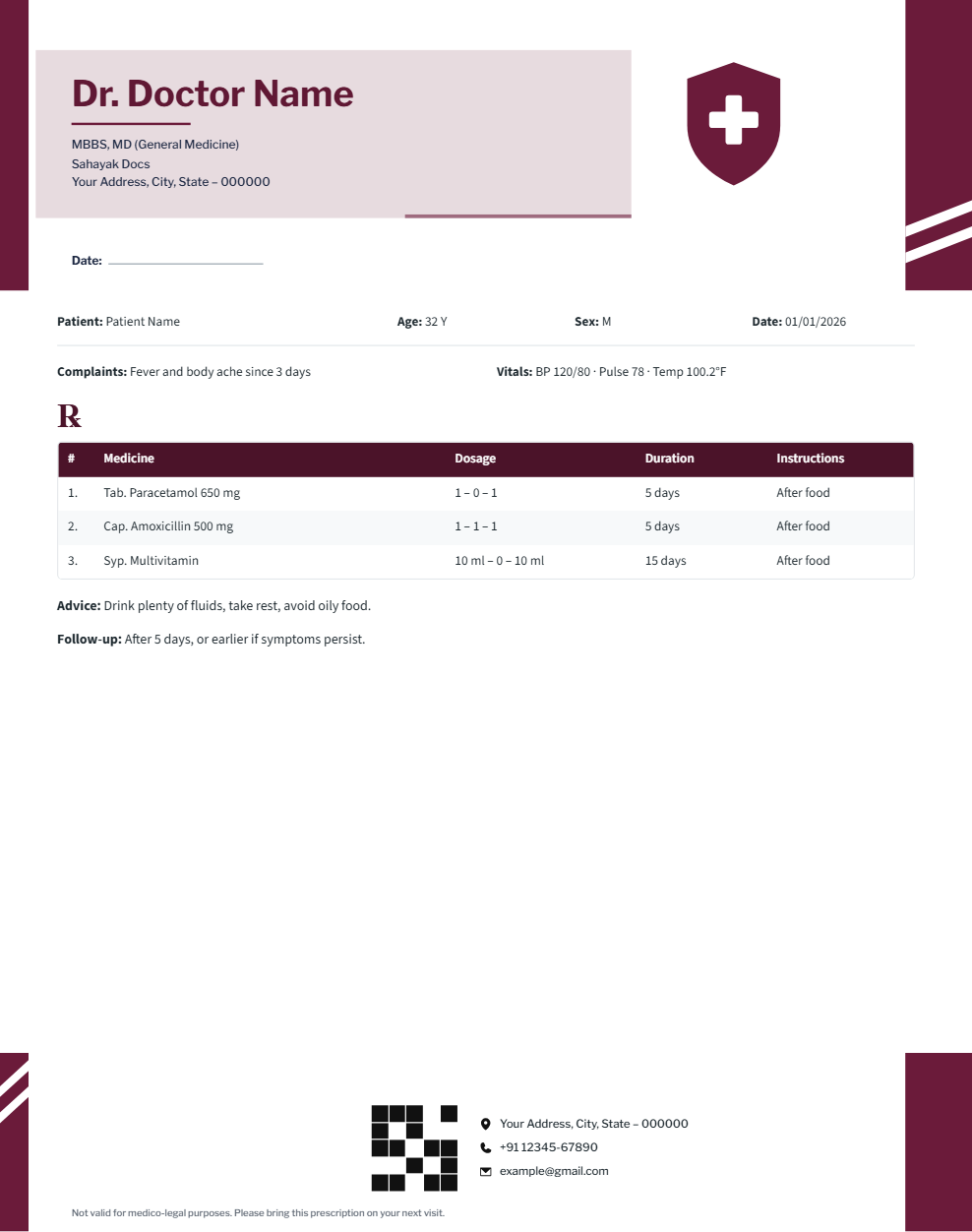
Open two or three examples in different colours before deciding — the same layout can look completely different in navy, maroon or forest green.
Why Sahayak Docs
- Free — every design and download, no sign-up, watermark optional
- Ready-made designs for your industry, editable down to every element
- PDF letter pads in A4, A5, A3, Letter and Legal, plus header & footer PNGs
- Works in the browser on computer, tablet and phone
Frequently asked questions
Can I use an example exactly as shown, with my own logo?
Yes — open any example, upload your logo, and type your own name, address and details; everything about the original example updates to yours.
What if none of the examples fit my business exactly?
Pick the closest one and adjust it in “Create your own” — move, resize, recolour or hide any part of the design, or add your own text and shapes.
Are these real designs or mockups?
They’re real, working designs — the same ones you’ll download. Nothing changes between the example you see and the letterhead you get.
Do you have a company letterhead example specifically?
Yes — see “Company letterhead” for examples built around a registered company’s needs (CIN, GSTIN, department letters), with your own name and logo in place as soon as you open one.
See letterhead examplesor read: How to make a professional letterhead (step by step)