With thousands of ready-made designs to scroll through, “which one looks nice” isn’t the most useful question. These are the factors that actually decide whether a design is right for your business.
1. Match your industry’s expectations first
| Business type | What tends to work |
|---|---|
| Clinics, labs, hospitals | Calm, minimal, generous white space — a reader scanning a prescription or report needs clarity, not decoration |
| Shops and retail | Bold, practical, big legible name and phone — a cash memo is glanced at, not studied |
| Corporate departments, law, accounting | Restrained and formal — one accent colour, no loud graphics |
| NGOs, trusts, associations | Trustworthy and simple — the registration numbers matter more than the artwork |
| Cafés, boutiques, studios | Some personality is expected here — a fully corporate design can undersell the brand |
2. Think about who reads it, and how fast
A cash memo handed to a customer gets a few seconds of attention — the shop name and total matter most. A legal notice or a CSR funding proposal gets read slowly by someone checking every detail — registration numbers and formal structure matter more there than visual flair. Let how the document is actually read drive how much hierarchy and decoration the design carries.
3. Start from what your field legally requires you to show
Some industries need more room reserved for compliance details than others — a civil contractor’s registration class, a trust’s 12A/80G numbers, a doctor’s medical council registration, a company’s CIN. Pick a design that leaves genuine space for these, rather than squeezing them in afterward.
4. Pick one accent colour — ideally from your existing brand
If you already have a logo, take the accent colour from it so the letterhead feels like the same brand, not a new one. If you’re starting from nothing, one deliberate colour reads as more professional than several competing ones.
5. Browse by your own industry, not the whole catalogue
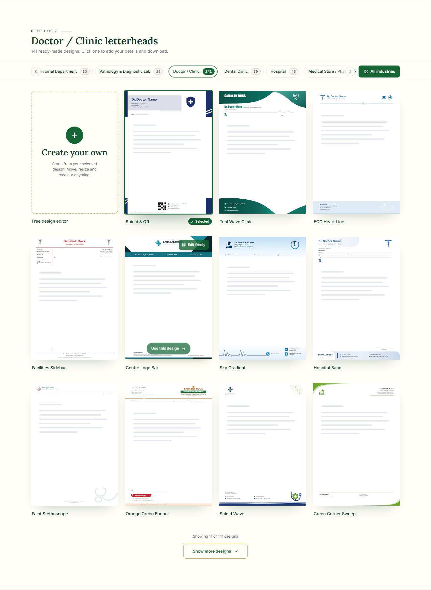
Comparing a shop design against a law-firm design tells you very little — they’re solving different problems. Filter to your own industry first, then compare designs that are actually competing for the same job.
6. Try it with your real details before deciding
A design that looks balanced with sample text can shift once it holds your actual business name, a longer address, or a six-digit registration number. Add your real details and look at the result before committing — not the other way round.
Short on time? Pick the closest design for your industry and adjust it afterwards in “Create your own” — nothing about the choice is permanent.
Frequently asked questions
Should I pick a design based on what competitors use?
Use it as a reference point for tone, not a template to copy. What matters more is whether the design leaves room for what your own business specifically needs to show.
Can I switch designs later without losing my details?
Yes — your name, logo, address and other details carry over to whichever design you pick, so trying a few before deciding costs nothing.