Most letterhead problems aren’t about taste — they only show up once the design is printed, scanned or read by someone other than the person who made it. Here are the mistakes that actually cause trouble, and what fixes each one.
Registration numbers too small to read once printed
A CIN, GSTIN or medical council number that looks fine at full screen zoom can disappear at actual print size. This isn’t cosmetic — an illegible CIN on a formal letter can be read as a compliance gap, not just bad design.
Print a real test page (not a screen preview) and check the smallest text at arm’s length, the way a reader actually holds a letter.
An overcrowded header competing with the letter itself
Cramming the logo, name, tagline, full address, phone, email and a registration number all into the header leaves no visual priority — and crowds the top of the actual letter. Move secondary details (address, registration numbers, a signature line) into the footer; keep the header to what a reader needs in the first second: who this is from.
A colour that looks fine on screen and vanishes on paper
Screens render colour brighter and more saturated than most office printers reproduce it. A light tint that looks subtle on a monitor can read as a faint grey smudge once printed, or disappear against white paper entirely.
- Prefer a darker shade of your accent colour for anything that must stay legible once printed
- Print one real test copy before approving a bulk print run
- Keep body text a strong dark grey or black regardless of your accent colour choice
A logo without a transparent background
A logo exported with a white (or wrong-colour) square background sits as an obvious box the moment it lands on a tinted header or coloured band. Use a PNG or SVG logo with a transparent background — most logo files from a designer already support this; re-export if yours doesn’t.
A tone that doesn’t match the reader’s expectations
A loud, multi-colour design undersells a law firm or CA practice, where restraint reads as credibility. Equally, an overly stiff, corporate-grey design undersells a café or a boutique, where some personality is expected. Match the design’s energy to what the reader already expects from that kind of business.
Deciding without your own details in place
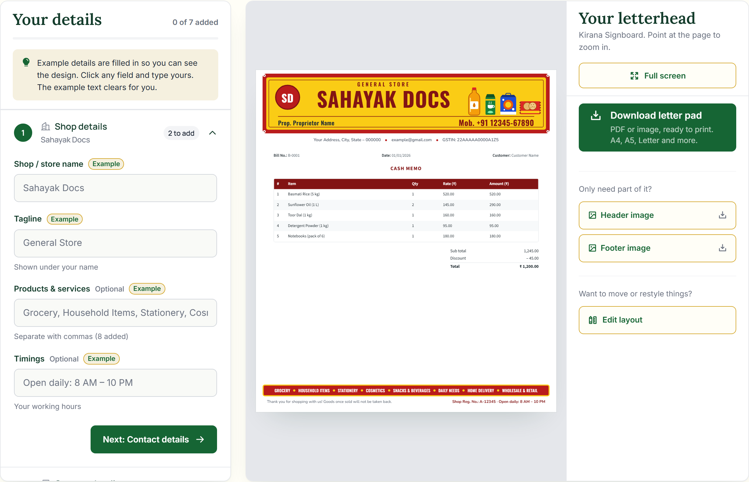
A layout that looks balanced with placeholder text can break the moment it holds your actual (longer, or shorter) business name, a two-line address, or a six-digit registration number. Always preview with your real details before deciding — not the sample text a template ships with.
See our guide on 10 letterhead design tips for the positive version of this list — fonts, spacing and colour rules to design by from the start.
Frequently asked questions
How do I know if my accent colour will survive printing?
Print one real test page on the printer you’ll actually use, in good light, and check it against the screen version. Darker shades are far more forgiving than light tints.
Is it ever okay to skip the footer?
Only if you genuinely have nothing to put there. Most letterheads benefit from moving the registration number, full address or a signature line into the footer rather than crowding the header.